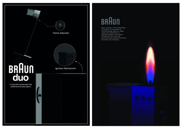
Reinterpretation for Braun


Materials:
Metal


Description:
My intention behind revisiting this product was not only to appreciate its visual simplicity but to deeply engage with the functional aesthetics and philosophical clarity that define Braun’s design language. Through 3D modeling, rendering, and poster creation, I aimed to study how minimal form, precision, and usability can coexist harmoniously in an everyday object.
When I began this project, I wanted to understand how such timeless products achieve emotional resonance without relying on trends or complexity. The Duo lighter, with its understated confidence, became an ideal subject to reinterpret through a digital medium.
The project began with extensive visual research gathering archival references, studying product photographs, vintage catalogs, and sketches from the 1970s. My focus was to decode the design logic: the scale, proportions, and user interaction. This research phase allowed me to translate physical realism into a digital 3D model that stays true to the original design while showcasing my own understanding of Braun’s design principles.
Using 3D modeling software, I recreated every element of the lighter from scratch including the ribbed texture of the body, the chrome details, and the sliding ignition mechanism. Attention to proportion and form was crucial, as Braun’s products often rely on subtle geometry and balance. The challenge was to maintain accuracy while ensuring the model conveyed a sense of tactility and usability.
Once the model was complete, I moved to KeyShot for rendering. Here, my primary focus was on achieving a realistic material definition and lighting setup that complements Braun’s aesthetic. The materials were carefully selected to represent the brand’s industrial minimalism matte black plastic with fine grooves, brushed aluminum for the control dial, and subtle reflections that highlight form without exaggeration.
Lighting played a critical role in conveying the object’s quiet sophistication. I used soft diffused lighting to bring out the product’s edges and textures without creating harsh shadows. The background was intentionally kept clean and neutral to reflect Braun’s visual identity simple, functional, and timeless.
